


")


By Aaron Ramson
On January 24, 1935, Virginia’s Gottfried Kreuger Brewery took a calculated risk in being the first ever brewery to can its beer. Two flagship beers were packaged in color coded cans, red for Special Beer, Green for Cream Ale, both featuring a simple art-deco design of the company’s logo, the “K-Man”. A stylized waiter in the shape of the letter K, the first ever beer can art was minimalist, to the point, and paved the way for 85 years of evolution. Today, beer cans have become very similar to record album covers in their use as functional art. Protecting the product inside, while advertising the content through use of graphic design, photography, and/or illustration, a badass beer label can make all the difference when choosing which new brew to try out.
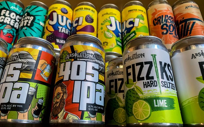
 Let’s be honest here. When you go to Bevmo or your favorite bodega or bottle shop, there’s an overwhelming number of IPAs to choose from. Some are in bottles, others in cans, a few you’ve no doubt had repeatedly, most you’ve yet to try (unless you’ve already tried all of them, which means you should maybe look into a recovery program or something), but if there’s one thing that catches the consumers eye, it’s flashy things; bright colors, big fonts, provocative imagery; that’s what gets our attention. In an online poll, 90% of suds lovers admitted to buying beer because of the label. The days of simple branding and modest design are firmly in the rear-view mirror. If you want to attract new fans, you need a beer they can show off on the ‘gram.
 Bay Area Instagrammer spokes_and_sudzz is a beer influencer who believes that can art is a major factor in 2020. “The can artwork has definitely become a driving force for many breweries, especially when they are just starting out”, says spokes_and_sudzz, “It draws not only the consumer to buy, but it also draws followers on social media visually”. Erik DeBellis, head brewer at Torrance, CA’s Absolution Brewing Co. agrees. “Label art is definitely more important now more than ever,” Erik explains, “With so much liquid out there, you have to have a way to get yourself noticed. Making great beer is the first step, but if you can’t catch the consumers eye, they may just pass it by for something else.” Graphic designer and rock guitarist Bobby Taffolla sums it up perfectly. “If I’m just cruising the boozin’ isle, usually a striking image/art on a can or bottle of beer is what potentially draws me to a potential passenger-seat twelver. Maybe it’s the hesher genetics in me, picking a new beer is very similar to how I would search out bands in the old days, by the vibe of the artwork.”
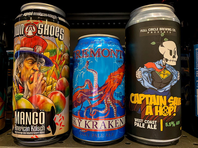
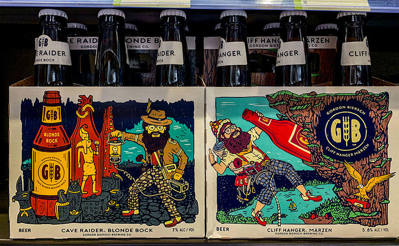
 Not every bottle of brew you see is decked out in splashy label art. Much like album covers, there’s a spectrum of label design that goes from over-the-top to minimalist, and everything in between. The iconic Pliny the Elder is an example of minimalist artwork on a best-selling beer. More often than not, it’s the elder statesmen of the craft brewing world who aren’t seeing the advantage of eye-popping graphics and design. Samuel Adams line of beers got a logo makeover in 2016, taking the old-timey, tavern aesthetic off of the label, and replacing it with a bolder and more mature version. While an improvement over the old, dated design, Samuel Adams beer looks plain and unimpressive on shelves next to more exciting labels. Other companies like Alpine Brewing, Anderson Valley, and San Diego’s Mission Brewery feature artwork on their bottles and cans that border on being antiquated, and do nothing to attract new drinkers, unaware of the quality that’s within. Firestone Walker managed to successfully redesign and update their label art to reflect the superior products they offer, while Hangar 24’s new label design felt flat and uninspired right out the gate.
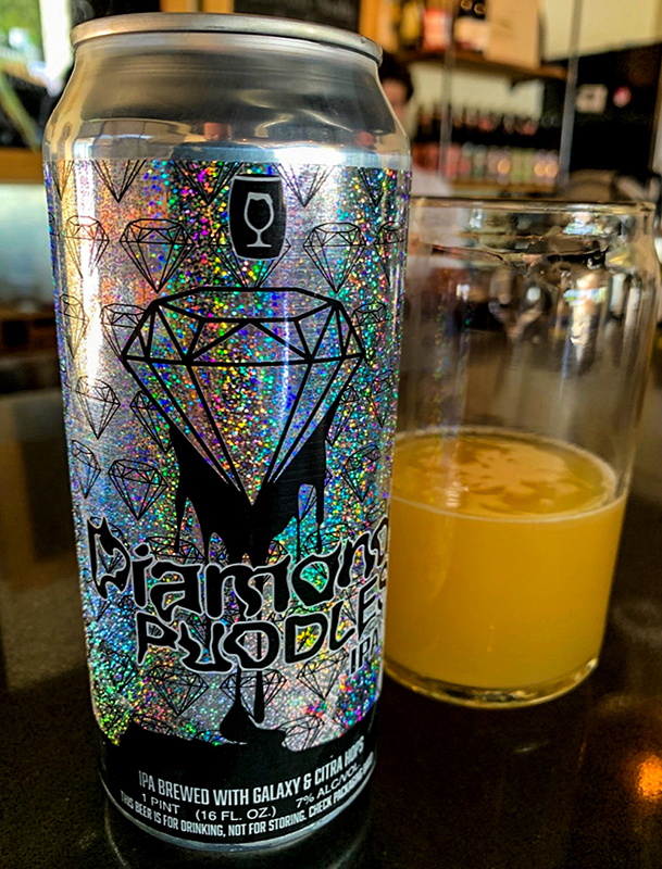 It’s hard to know what drives the choices made by each brewery, but it seems like smaller, start-up breweries are quicker to reboot when needed. Absolution Brewing did just that, a major reboot to the beer recipes as well as the art accompanying each product, to great success. “I think a lot of the bigger guys are scared to take risks”, offers Head Brewer DeBellis, “A lot of bigger breweries are missing the mark, and it’s puzzling.” If one thing is clear, it’s that quality art and beer combine to create a memorable product that consumers will want again, and this is far more important to the little guys in craft beer than it is to an established mega-brewery. Absolution Brewing Company may not have a team of Clydesdales and a trademark on the term “beechwood aging,” but they employ millennials who know what imagery people aged 26-40 are attracted to, and flavors to match the bright, big designs. Santa Rosa, CA’s Cooperage Brewing Company spared few expenses in wrapping their Diamond Puddles hazy IPA can in glitter, which is as eye catching as beer could possibly hope to be. Bobby Taffolla asserts, “A craft beer with a striking image will always have me give it a closer look. And if the artwork and the taste go hand in hand in quality, I may just have to throw down for a second go of it!”


